
앞 글: [Android Dialog] 1. Compose Dialog를 이용해 커스텀 다이얼로그 만들기
앞의 글에서 Dialog 객체는 커스텀한 content를 직접 모두 그려서 만들었다. 하지만 매번 이렇게 모든 Dialog를 커스텀 하는 것은 비효율적이다. 어차피 다이얼로그에서 우리가 필요로 하는 기능은 대부분 획일화 되어있고, 사용자가 사용하기 편한 UI/UX는 정해져 있기 때문이다.
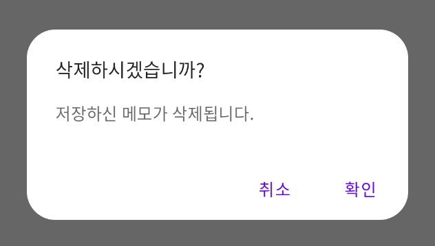
예를 들어 메모장 앱에서 저장된 메모를 삭제하려고 하는 경우 다음과 같이 만들 수 있다.

이러한 다이얼로그를 만들기 위해 모두 다 Custom하게 만드는 것은 개발 리소스의 낭비이고, 가독성을 위해서도 규격화된 다이얼로그인 AlertDialog를 쓰는 것이 좋다.
아래에서 AlertDialog를 이용해 위 다이얼로그를 어떻게 만드는지 살펴보자.
Compose AlertDialog를 이용해 다이얼로그 만들기
AlertDialog는 이러한 어느 정도 스타일링이 된 다이얼로그이다. 다이얼로그는 총 4가지 Composable 을 설정할 수 있고, 3가지 디자인 요소를 설정할 수 있다.
@Composable
fun AlertDialog(
    onDismissRequest: () -> Unit,
    confirmButton: @Composable () -> Unit, // Composable
    modifier: Modifier = Modifier,
    dismissButton: @Composable (() -> Unit)? = null, // Composable
    title: @Composable (() -> Unit)? = null, // Composable
    text: @Composable (() -> Unit)? = null, // Comoposable
    shape: Shape = MaterialTheme.shapes.medium, // Design
    backgroundColor: Color = MaterialTheme.colors.surface, // Design
    contentColor: Color = contentColorFor(backgroundColor), // Design
    properties: DialogProperties = DialogProperties() // Properties
)Composable 영역 설정하기
Composable 영역은 고정된 공간에 Composable을 채워넣는 식으로 구성된다. 고정된 공간은 총 4가지이며 위치는 다음과 같다.
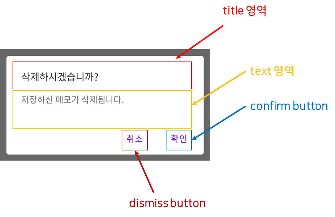
- title : 다이얼로그의 제목
- text : 다이얼로그의 텍스트
- confirmButton : 확인버튼
- dismissButton : 취소버튼
Composable영역만을 설정하여 그림2의 다이얼로그를 만들면 다음과 같이 만들 수 있다.
@Composable
fun KotlinWorldDialog() {
    AlertDialog(
        onDismissRequest = {},
        title = {
            Text(text = "삭제하시겠습니까?")
        },
        text = {
            Text(text = "저장하신 메모가 삭제됩니다.")
        },
        confirmButton = {
            TextButton(
                onClick = {}
            ) {
                Text("확인")
            }
        },
        dismissButton = {
            TextButton(
                onClick = {}
            ) {
                Text("취소")
            }
        }
    )
}
title 영역은 맨 위의 고정된 공간을 차지하며, text영역은 title을 설명하는 중간 공간을 차지한다.
dismiss button은 왼쪽에 들어갈 버튼이 되고 confirm 버튼은 오른쪽에 들어갈 버튼이 된다.
Design
하지만 그림2를 실제 프로덕트에 쓰기에는 무리가 있다. 이를 위해 AlertDialog에서는 다양한 디자인적 커스텀 요소를 제공한다. 커스텀 요소는 다음과 같다.
- shape : 다이얼로그의 모양(Rectangle, RoundedCornerShape 등)
- backgroundColor : 배경 색상
- contentColor : 콘텐트 색상(텍스트, 버튼 등)
우리는 위의 그림2를 조금 더 개선해보도록 하자. 배경색과 글자 색상은 괜찮은데 Corner가 너무 각져있다. Corner을 조금 더 둥글게 만들어 보도록 하자. Corner을 둥글게 만드는 것은 shape에 RoundedCornerShape을 줌으로써 가능하다.
@Preview
@Composable
fun KotlinWorldDialog() {
    AlertDialog(
        onDismissRequest = {},
        title = {
            Text(text = "삭제하시겠습니까?")
        },
        text = {
            Text(text = "저장하신 메모가 삭제됩니다.")
        },
        confirmButton = {
            TextButton(
                onClick = {}
            ) {
                Text("확인")
            }
        },
        dismissButton = {
            TextButton(
                onClick = {}
            ) {
                Text("취소")
            }
        },
        shape = RoundedCornerShape(24.dp)
    )
}위 코드를 수행하면 다음과 같은 다이얼로그가 나온다.
이런 식으로 다이얼로그를 커스터마이징 할 수 있다.
AlertDialog 버튼 커스터마이징하기
위에서 다룬 AlertDialog는 커스터마이징을 최소한으로만 할 수 있는 다이얼로그이다. 내부는 다음과 같다. 내부를 보면 AlertDialog를 한 번 더 감싼 형태이다. 만약 버튼을 없애고 싶거나 버튼의 위치를 커스터마이징 하고 싶다면 버튼의 위치와 수량을 마음대로 정할 수 있는 다음 AlertDialog를 사용하면 된다.
@Composable
fun AlertDialog(
    onDismissRequest: () -> Unit,
    buttons: @Composable () -> Unit,
    modifier: Modifier = Modifier,
    title: (@Composable () -> Unit)? = null,
    text: @Composable (() -> Unit)? = null,
    shape: Shape = MaterialTheme.shapes.medium,
    backgroundColor: Color = MaterialTheme.colors.surface,
    contentColor: Color = contentColorFor(backgroundColor),
    properties: DialogProperties = DialogProperties()
)위 AlertDialog의 영역은 다음과 같다.

따라서 그림3의 버튼의 확인과 취소 버튼을 바꾸고 버튼은 가로로 균형감 있게 배치하고 싶다면 다음과 같은 방법을 사용하면 된다.
@Composable
fun KotlinWorldDialog() {
    AlertDialog(
        onDismissRequest = {},
        title = {
            Text(text = "삭제하시겠습니까?")
        },
        text = {
            Text(text = "저장하신 메모가 삭제됩니다.")
        },
        buttons = {
            Row(modifier = Modifier.fillMaxWidth().padding(bottom = 12.dp), horizontalArrangement = Arrangement.SpaceEvenly) {
                TextButton(
                    onClick = {}
                ) {
                    Text("확인")
                }
                TextButton(
                    onClick = {}
                ) {
                    Text("취소")
                }
            }
        },
        shape = RoundedCornerShape(24.dp)
    )
}

